

› UKTH forums › UKTechHub News & Information › UKTechHub New Front Card Layout Improvements Forum Update: A Fresh New Look for the Front Page Over the past few weeks we’ve been making a number of improvements to the forum layout and navigation experience. The...
- This topic has 1 reply, 2 voices, and was last updated 33 minutes ago by
 Grisu.

- AuthorPosts
- October 11, 2026 at 7:09 am #44308
Forum Update: A Fresh New Look for the Front Page
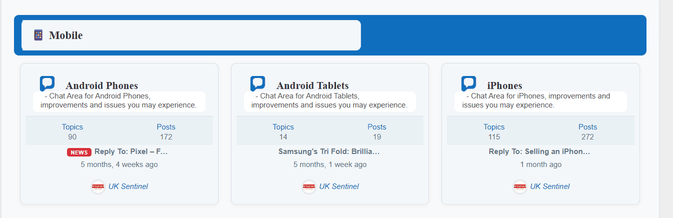
Over the past few weeks we’ve been making a number of improvements to the forum layout and navigation experience. The forum homepage now features a cleaner ‘improved’ card-based design, improved spacing, clearer category separation, and a more modern appearance across desktop and mobile devices.
These changes are designed to make it easier to discover discussions, browse forum categories, and quickly find the latest activity. As always, this is still work in progress so please let us know what you think and report anything that doesn’t look quite right.
Thank you for helping make UKTechHub a better community for everyone.
Attachments:
In a completely sane world, madness is the only freedom (J.G.Ballard).
You need to login in order to vote
October 11, 2026 at 8:37 am #44310Sorry, didnt realize any changes.
But the range to read postings is only about a forth of my 27″ monitor.
So titles and other things uses a lot to much space.
Even attachments could be much smaller.
Just my personal 2 cent about this topic.You need to login in order to vote
- AuthorPosts



- You must be logged in to reply to this topic.